Typography in Branding Design
Typography in Branding Design

In the present digital world, brand designers are cautious of typography and design. The work of Gary Hustwit explains this in Helvetica, a documentary film that explores how fonts influence our daily lives. If you are designer that appreciates the beauty of topography, the chances are that you will try as much as possible to explain it to a client or friend.
You will even strife to sensitize them on why they should make typography a unique feature in giving their brands aesthetic look. The choice of typefaces and their layout is as important as the use of colour, icons or virtual graphics in developing a brand, and this is usually easy to explain. This article uses analogy to explain to typography in branding.
The only distinction between good typography and bad one is the one between brand that looks professional and one that looks amateur. One reason Nike’s stores look so pretty is the wise and regular application of matchless typeface and front.
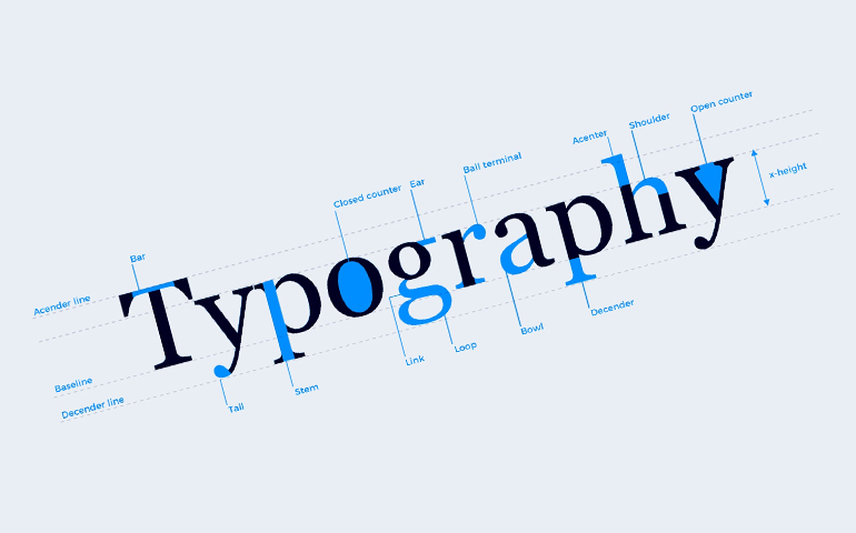
It may interest you to understand some terms that help to fully comprehend typography. Font is a set of typefaces with similar features while typefaces are known as individual intimate associate of that font. If you take Gotham for example, you can have Gotham light and Gotham light italic. In the above instances, Gotham is the font while light and light italic are the typefaces.

Typography is not different from fashion. The reason why we have novel clothing design is because people want to appear different and there are countless styles. True invention is not easy to come by, but people constantly develop new variations on old ideas or twist existing component using new techniques, maybe in type design or dress.
The types of clothing designs we see in boutiques are generally the fashion on an equal footing with typography. It operates in sharp conditions to create a timeless style that speaks very strongly. Daily dressing styles are also special, expressing themselves in subtle manners, like text selections in typography.
Moreover, Typefaces are like relics that possess both aesthetic and functional values. A great typeface must be visually appealing and achieve other functions at the same time. It should be legible for printing a newsletter. Typography is an art of designing as well as science of blending typefaces to achieve brand that is timeless and matchless in competitive world of branding design.
If you reside in York and wish to know more on typography in branding design or you want your company to have a touch of it, then look no further. Impulse is the best branding firm you can rely on.
For further information about full branding packages in and around West Yorkshire, call 01904 430 666 or get in touch with us via the contact form below.


