Graphic Design and use of Colours
Graphic Design and use of Colours

There are many different elements that a graphic design company will take into account when creating a unique design for you and your business. One element that is often somewhat overlooked, but which plays a major part in the overall design is colour. If you are looking to brand you company via a logo or website design, you will want the images and design to best convey what it is that you are offering the consumer. What you may not know is that colour can help you do that, with specific colours used to deliver a certain type of feeling or emotion to the viewer. Companies that have successfully branded themselves may change their brand in subtle ways, but the colour is seldom, if ever, tinkered with.
At its most base level, colour is used to catch the eye and draw in your attention, but it runs a good deal deeper than just that. Colour has to tell the customer something about what it is that you have to offer. For example, how confusing would it be if you had a landscaping company and your logo used colours other than earth tomes? Even if a tree featured in the logo, colouring it blue or some other unnatural shade would make the viewer question what they are looking at and wondering what it is you actually offer.
While it is absolutely essential that you deliver a great product or service if you want your business to succeed, the way in which you present yourself is also incredibly important. If potential customers look at your brand and have to try and spend time thinking about what you do, you are already in trouble. Colour and the use of specific combinations can definitely help speed that process along, whilst also delivering a favourable first impression.
Before talking about the perceived meanings of specific colours, it’s worth taking a quick look at how a graphic design company might explain how those colours are presented within the design. When talking about hue, they are essentially talking about the basic value of a colour (blue, red, green, etc.). The saturation refers to brightness of the colour presented, whereas value is more about the specific lightness and darkness of a colour scheme.
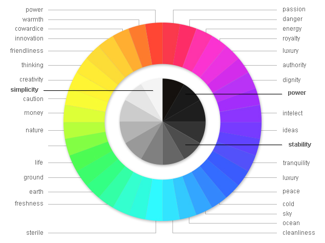
There are very definite feelings and emotions delivered by colours, which is why some are definitely more suited to one industry over another. Red or black is often used by a brand looking to display power, with the latter also often used to show that something is classy or luxurious. Blue is very often used to give off a sense of stability and confidence, whereas green can have a calming effect that brings you back to nature. Bright colours like yellows and oranges are often used in children’s endeavours, whereas pink is a delicate colour that is used in female-friendly businesses.
As you can see, the use of colour can be the difference in delivering one message over another, with the wrong choice often leading to confusion. A good graphic design company will know the difference, and will be well aware of which colours work best for what you are trying to achieve.
For support with colour choice or colour psychology, or simply for more information, call 01904 430 666 or get it touch via the contact us page.


